
Thursday, October 27, 2011
Color Balance
Thursday, October 20, 2011
Map Project

Thursday, October 13, 2011
Radial Symmetry/Spiral
 Radial symmetry is one of my favorite kinds of symmetry (although it's weird enough actually having a favorite type of symmetry, I guess...). I thought this image was pretty cool because the focal point isn't directly in the middle, and is instead placed near the lower right corner, making the entire picture more of a spiral. The focal point is also lighter in color than the rest of the image, which also helps to get our attention. Then the petals start spiraling out, and the further out they get the looser they become, creating a nice pattern throughout the picture. This pattern actually creates movement, bringing the eye from the center of the flower to the far edges.
Thursday, October 6, 2011
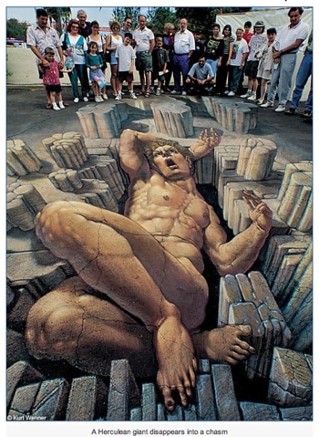
Depth
Subscribe to:
Posts (Atom)